ShopDreamUp AI ArtDreamUp
Deviation Actions
![Smol Nozomi [HD REMASTERED] by SynergicStar](https://images-wixmp-ed30a86b8c4ca887773594c2.wixmp.com/f/75ad07bb-6657-4c7e-8e56-5e08b8c60419/dabo1c2-d30496ca-4941-46d6-9a6f-858b95398c06.png/v1/fill/w_894,h_894/smol_nozomi__hd_remastered__by_synergicstar_dabo1c2-pre.png?token=eyJ0eXAiOiJKV1QiLCJhbGciOiJIUzI1NiJ9.eyJzdWIiOiJ1cm46YXBwOjdlMGQxODg5ODIyNjQzNzNhNWYwZDQxNWVhMGQyNmUwIiwiaXNzIjoidXJuOmFwcDo3ZTBkMTg4OTgyMjY0MzczYTVmMGQ0MTVlYTBkMjZlMCIsIm9iaiI6W1t7ImhlaWdodCI6Ijw9MTAyNCIsInBhdGgiOiJcL2ZcLzc1YWQwN2JiLTY2NTctNGM3ZS04ZTU2LTVlMDhiOGM2MDQxOVwvZGFibzFjMi1kMzA0OTZjYS00OTQxLTQ2ZDYtOWE2Zi04NThiOTUzOThjMDYucG5nIiwid2lkdGgiOiI8PTEwMjQifV1dLCJhdWQiOlsidXJuOnNlcnZpY2U6aW1hZ2Uub3BlcmF0aW9ucyJdfQ.tbazh_Co5tAXvHdLp3vBgKNER9CR5HyRM-FOuuoSfok "Smol Nozomi [HD REMASTERED] by SynergicStar")
Remake the image above, into anything you want, and submit it here!
Or make an original image in its style.

Submitting is simple:
Just post your submission as a comment, and I'll add the image to this post.
While there aren't any prizes for this contest, it's a great way to get publicity and feedback on your art!
Read the following Journal post for the full introduction, with the contest's rules and other crucial information:

[CONTEST] Smol Nozomi Remakes (Introduction)
Remake the image above into anything you want, or make a new image in its style, and submit it here!
Submitting is simple:
Just post your submission as a comment, and I'll add the image to this post.
While there aren't any prizes for this contest, it's a great way to get publicity and feedback on your art!
Editor's note: originally, this portion of the post was in the contest's Journal entry itself. However, I encountered some data limits on the post at about the 36th entry. So instead of sacrificing the images, I decided to take this portion out instead.
Rules:
1. Each image must be one that YOU made.
2. Images must bear some resemblance to the one above.
Examples of how you can remake this image into something else, as made by myself and other people, can be found below (These are examples, NOT submissions to the contest):
By SynergicStar:
Generation 3 of this contest is finally here, and submissions are being added!
To see the previous Generations of this contest, look here:
[CONTEST] Smol Nozomi Remakes
Remake the image above, into anything you want, and submit it here!
Submitting is simple:
Just post your submission as a comment, and I'll add the image to this post.
While there aren't any prizes for this contest, it's a great way to get publicity and feedback on your art!
Read the following Journal post for the full introduction, with the rules and other crucial details; I had to cut it from here due to data limitations on the post:
All currently-recognized submissions, with feedback from me, are below.
UPDATE: ALL FUTURE SUBMISSIONS WILL BE MOVED TO THE FOLLOWING POSTS.
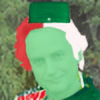
Entry #1 - "smol peepsi"
Submitted on December 1, 2016 by brzozod526
Overall, I was blown away by this image, from its shading to the incredible adaptation of Smol Nozomi.
Long live (and since it'
[CONTEST] Smol Nozomi Remakes (+ Other Smols) 2.0
Remake the image above, into anything you want, and submit it here!
Or make an original image in its style.

Submitting is simple:
Just post your submission as a comment, and I'll add the image to this post.
While there aren't any prizes for this contest, it's a great way to get publicity and feedback on your art!
Read the following Journal post for the full introduction, with the contest's rules and other crucial information:
Generation 2 of this contest is finally here, and submissions are being added!
To see the previous Generation of this contest, look here:
And for more information on how this
Remake the image above, into anything you want, and submit it here!
Submitting is simple:
Just post your submission as a comment, and I'll add the image to this post.
While there aren't any prizes for this contest, it's a great way to get publicity and feedback on your art!
Read the following Journal post for the full introduction, with the rules and other crucial details; I had to cut it from here due to data limitations on the post:
All currently-recognized submissions, with feedback from me, are below.
UPDATE: ALL FUTURE SUBMISSIONS WILL BE MOVED TO THE FOLLOWING POSTS.
Entry #1 - "smol peepsi"
Submitted on December 1, 2016 by brzozod526
Overall, I was blown away by this image, from its shading to the incredible adaptation of Smol Nozomi.
Long live (and since it'
Remake the image above, into anything you want, and submit it here!
Or make an original image in its style.
Submitting is simple:
Just post your submission as a comment, and I'll add the image to this post.
While there aren't any prizes for this contest, it's a great way to get publicity and feedback on your art!
Read the following Journal post for the full introduction, with the contest's rules and other crucial information:
Generation 2 of this contest is finally here, and submissions are being added!
To see the previous Generation of this contest, look here:
And for more information on how this
And for more information on how this contest's Generations work, read this FAQ section:
[CONTEST] Smol Nozomi Remakes (FAQs and Rules)
The Contest:
Remake the image above, into anything you want!
Or, create an image in its style.
I'm posting this to address some FAQs I get about the contest,
and ones that people might hypothetically ask me, while clarifying its rules.
Here are links to the contest itself:
Question #1:
"Who/What inspired you to make this contest?"
My answer: Three Deviants deserve credit for inspiring me to make this contest, even if none of them directly worked with me in creating it:
Triple-Q
As far as I know, Triple-Q ( http://triple-q.deviantart.com/ ) is t
I'll put as many entries as I can fit into Generation 3 without cutting back on details.
I can't say exactly what that amount is, but in Gen 2, it was 54.
By the way - this contest is operated solely by me, but it was also approved for placement on the Pencils-Active Deviant Group.
( pencils-active.deviantart.com/ )
The-Dank-Meme-Squad
( the-dank-meme-squad.deviantart… )
LoveLiveCentral
( lovelivecentral.deviantart.com… )
and AnimeAraiansu.
( animearaiansu.deviantart.com/g… )
This contest now has a Deviant Group of its own!
smol-nozomi-remakes.deviantart…
All currently-recognized entries are below, sorted by the ranking I'd give them. New entries will be added to the list as their creators send them to me, and ratings at any given time are not permanent. So yes - there's always a competition for 1st Place, since every entry has the potential to take it.
[UPDATE] All future entries will go on the following post:

Entry #1 - "Smol Nozomi Dancing"
Submitted on January 4, 2017 (Officially added on January 13) by Bingus-Domingus (with special credit to CorBond57 from GameBanana)
While this image was made into a .gif file by Bingus-Domingus,
the animation comes from a Smol Nozomi mod for SSB4 ( gamebanana.com/skins/152048 ) made by a GameBanana user named CorBond57. The mod was actually used in a SiIvaGunner rip: [link]
I try to be substantive when giving praise, avoiding emotions and personal taste in favor of the details that evoke them. Instead of calling something cute, I'd prefer to describe what details make it cute, so other artists can learn from it. But in this case, I could be at a loss for words; this animation looks adorable - plain and simple.
Maybe it's the minimalist, constant smile on Smol Nozomi that makes it cute, but would look unnatural in any other art style. Maybe it's the little dance she does, with arms waving and simple footwork, and how it resembles a routine that a small child might do, that looks endearing. Whatever it may be, something makes the whole animation amazingly cute.
The shading here, from how Smol Nozomi's shadow matches the direction of the sunlight to how her hair and skirt react to being moved around, looks almost professional. Similarly, how Smol Nozomi moves around is natural; the head, torso and hair all follow one another as they turn. And the camera's zooming is a welcome addition, highlighting the incredible work put into modeling Smol Nozomi.
I'd love to see a larger version of this, where Smol Nozomi's hair isn't cut off by the screen size. I'd also appreciate seeing more animations in the contest, even if this one's astounding quality is hard to follow up. But whether they can meet this astronomically high standard or not, I'd be glad to see them anyway.
[UPDATE (2/5/2017)] - weegeeguy01 actually made a larger version of this!
 by weegeeguy01")
Entry #2 - "All Waifus Can be Copied"
Submitted on January 9, 2017 (Officially added on January 17) by ajkirby2
ajkirby2 returns with another smol of T-shirt-worthy quality; and like "Smol 'Damegami' Aqua", this comes as a T-shirt too!
www.teepublic.com/t-shirt/1088…
Interestingly, this was also included in a piece of fan art he made for my latest album of high-quality rips! (That's now the album's official cover) Links to both the art and album can be found here:
CLICK HERE to see "Unofficial Holiday Album #1 - Cover"
CLICK HERE to see "Kingpin of Memes - Unofficial Holiday Album #1"
I'll be focusing on the Smol Asuna for my critique.
As for the Kirby to the right, it looks great (superb shading, facial expressions and color choices), but since this is a Smol Nozomi Contest, and not a Kirby Contest (which is honestly a great idea in its own right; if someone starts one of those, I'd love to see it.), that's what matters most here.
For anyone who hasn't read my critique of "Smol 'Damegami' Aqua", you can find that below. I mention it because all of that image's strong points apply here - great shading that conveys the illusion of depth, superb texture and lighting work on the hair, and incredible attention to detail. But I put this one above "Smol 'Damegami' Aqua" for surpassing its attention to detail. With a more complex character design to draw, it creates an even more impressive image.
With all of the qualities that made his previous entry so great, that have all been improved or matched here, ajkirby2 produces his best smol yet. It's hard to not understate how much I look forward to more of his work, whether for this contest or not.
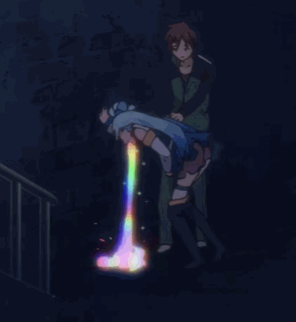
Entry #3 - "Smol 'Damegami' Aqua"
Submitted on January 1, 2017 (Officially added on January 8) by ajkirby2
ajkirby2 returns with another superb smol, this time based on a scene from Konosuba ( orig05.deviantart.net/8719/f/2… ).
It's immediately clear that ajkirby2 designed this smol from scratch, since it has a different pose, facial expression and set of clothes from Smol Nozomi. So how does it hold up, and resemble its inspiration?
The smol's clothing matches what I can see from the .gif perfectly. With great lighting, especially along where the skirt covers the legs, while being translucent, it sells the illusion of depth flawlessly. I'm especially fond of how the dress is shaded to look 3-dimensional; notice how across the bottom, its shadows curve, making the dress "pop out" (visually).
The hair is where this style truly shines; darker, deeper blues alongside lighter and less blue parts beautifully add depth, while thick and well-placed shadows complement them. The small bright and dark lines also add more texture to the hair, while staying true to its original style.
Even simpler details, like the rainbow, show immense skill and effort; its colors splash at the bottom, and form a round puddle, just like in the .gif. While the rainbow in the original had horizontal stripes instead of vertical ones, perhaps it may be better off looking different. Matching the original animation's rainbow would make it harder to see the drops splashing out, since they would be mostly in front of the whole rainbow, and behind similar colors. This might be one case of taking liberties with the design to the image's benefit.
Overall, I've hardly been more impressed by an entry to this contest. Its original design, meticulous details and shading, combined with superb use of depth and texture, make this one of the best - if not THE best - smols I've ever seen.
What's especially interesting is that you can buy this as a shirt design (for shirts of many different kinds), mug, notebook cover, and a laptop or phone case!
This is also true for his first entry, "Smol Nep"; links to both shirts/mugs/cases/etc. are below. So if you're a fan of either Konosuba or Hyperdimenion Neptunia (What this entry and "Smol Nep" respectively are inspired by), or you just want this contest's first bits of merchandise, I'd highly recommend purchasing these in some form. All credit (and presumably all money from purchases) goes to ajkirby2 for putting his work in these forms.
I never thought that the contest would come as far as it has - not only in terms of how many smols are in it, or that it has gotten entries almost daily for over a month now, or even in how amazing so many of them look.
Instead, I'm referring to the number of formats that these entries have been made into - digital and hand drawings, pixel art, 3-D models, and now including designs for coffee mugs, phone cases, and shirts - what this community has come up with blows my mind. So to anyone out there, who wants to make entries in unique formats - remember that you could make an entry using anything. And if you do, make sure to learn from the talents of those like ajkirby2.
Entry #4 - "Lazysmol Podcast"
Submitted on January 14, 2017 (Officially added on January 22) by SlimyFrick
Inspired by the LazyCast podcast ( www.youtube.com/channel/UCB7mG… ), every member of the cast has been remake in smol form. And they all match their original artwork effortlessly. I tried to find even one detail that looked off from the original cast, or appeared to be missing, and failed.
One of my favorite parts of all 4 smols has to be their hair; I'm especially fond of how light streaks across the top of each one's head. Every other bit of lighting/shading matches the cast's original color scheme, as well as the overall art style, and all areas except for one look exactly how they should.
That one exception is DoopieDoOver's left hand; the shadow on it should curve upwards, covering its left side.
But aside from that, it's a timeless example of how to make shading that isn't intrusive, but still serves its purpose. None of the shadows - not even the one I suggested changes to before - appears too dark. But they all contribute to a style that's pleasant to look at, whether in a passing glance or an intense stare. While writing this critique, there were many moments where I looked back at these smols, to marvel at all the finer details SlimyFrick added. And the way he expanded on Smol Nozomi's art style, with such stylish shading work, made my repeated looks at this entry worthwhile.
Entry #5 - "Pilot Nozomi Tojo"
Submitted on January 14, 2017 (Officially added on January 16) by SlimyFrick

Inspired by a pose that Fox has in SSB4 ( www.ssbwiki.com/images/thumb/7… ), this image puts an incredibly expressive face on Smol Nozomi, with great shading as well. Notice how the shadows loosely match the shapes that create them, while capturing how the hair would be somewhat round. Further establishing this are the light portions around its edges. Even the face has some subtle shadows on it, that add depth to the image. But easily the image's most stylish feature is Smol Nozomi's face; the eyebrows highlight her gaze to the right, which the normal eyes of a smol couldn't capture. In turn, these eyebrows add even more illusions of depth, to an image that already has it in spades. Clearly, SlimyFrick has a knack for shading, facial expressions, and making the audience perceive depth.
Entry #6 - "Smol Magical Girl"
Submitted on January 25, 2017 (Officially added on February 9) by An-Evil-Wizard
This entry is inspired by Magical Girl from Lobotomy Corporation ( www.lobotomycorp.kr/wp-content… ), an early-access "Monster Management Rogue-Lite Simulation game" by the South Korean indie studio "Project Moon" ( www.lobotomycorp.kr/en/about-g… ). And taking this entry's inspiration into account, it's a superb rendition of its source material. Every detail matches exceptionally well, and the unique shading style suits this image. Magical Girl's hair color blends from light blue to almost indigo, as shown in the reference image; mimicking that through normal blending would look simplistic and uninteresting. Instead, An-Evil-Wizard used shadows with an almost scratchy texture, that gives the illusion of hair with strands. The way they curve to reflect the hair's shape - although not seen in its source material - was an artistic liberty worth taking. Even outside the hair, An-Evil-Wizard used shadows to incredible effect, striking a balance between subtlety and visibility.
One of my favorite details has to be the shine on the heart atop Magical Girl's hair; its qualities epitomize this entry's strengths. The light is just as apparent as it should be, and not only matches its source material, but I would argue even surpasses it. The original heart on Magical Girl's hair has a far smaller region that shines, and doesn't work nearly as well to convey depth or lighting as a result.
And although this image imitates Magical Girl's likeness well, there are some details that could be revised to look better, while staying faithful to their inspiration. I'd be curious to see how the eyes look in some different forms - with Magical Girl's eyebrows, perhaps in the outline's color instead of being yellow, or maybe even ditching smol eyes entirely, to replicate her eyes as they normally are. I can't tell which of these would look best, but I would encourage An-Evil-Wizard to at least give them all a try.
Furthermore, changing the mouth could help; as of right now, its left corner seems a bit too shallow, and making it curve closer to the bottom of her head would resolve this. From my perspective, even when turning my head to view it, the mouth isn't curved parallel with the head.
Although I'd recommend revising this entry with my advice in mind, I don't want to ignore what An-Evil-Wizard has already been done well here - the hair, overall attention to detail, and shading - and how it's some of the contest's best work so far. My few points of contention are nitpicks of a great image; but nonetheless, fixing them would be an improvement.
Entry #7 - "[Contest Entry] Smol Melting"
Submitted on January 7, 2017 (Officially added on January 22) by SlimyFrick
Without a doubt, SlimyFrick has been one of this contest's most prolific and talented Deviants so far. And with this entry - based on Melting from Nuclear Throne ( vignette4.wikia.nocookie.net/n… ) - he puts another impressive take on Smol Nozomi. By far, his greatest achievement with this smol is the shading, which matches the art style of its source material. Shadows are somewhat thick, and keep the image's beige hue. This becomes especially amazing where Melting is... well, melting. Well-placed shadows help to separate drops from the body, while conveying thickness. It's an impressive use of this art style, that maintains the original's look, even in smol form.
Entry #8 - "Smol"
Submitted on January 4, 2017 (Officially added on February 9) by CawinEMD

As smol versions of the creator's Splatoon OCs, these 6 smols pose an interesting challenge for my critique - a lack of reference images to use. But they do use poses from "Smol μ's" by Triple-Q ( triple-q.tumblr.com/post/15267… ), which lets me judge how they were used as a foundation.
Through their unique hair styles, clothing, and various other details (such as glasses, goggles, and some sort of purple eyeliner), these smols do more than enough to seem distinct from their inspirations. And what's there has a consistent style, boasting a variety of colors. My favorites are probably the bottom right, top right and bottom middle ones, for their color schemes, hair and facial expressions. And even the others have remarkable effort put into them, especially with their outlines. These vary in thickness, depending on where they are in the drawing; for example, the top right smol has thinner outlines the higher you look on its hair, which makes every strand pop out on the face, but not interrupt the hair's shape.
Similarly, on the smol with beige hair, the arms have thicker outlines on their bottom halves than on top, making them look more 3-dimensional.
Aspiring smol artists - take note. Simple tricks like this can help to shift an image's focus, highlighting parts that you want the audience to see, while still putting a reasonable outline over every part.
Entry #9 - "jetpack smol nozomi"
Submitted on January 6, 2017 (Officially added on January 14) by CynikalTazumu

With its beautifully gradated sky (notice how it gets lighter the further down you look), and wispy clouds, it's clear that a lot of effort went into making even the background. As for Smol Nozomi herself, the hair looks 3-dimensonal, due to some well-placed shadows that match the overall style of this smol. Her face, with its gentle smile, eyes and eyebrows, fits in beautifully here. So while the art style on this version of Smol Nozomi may be somewhat simple, even compared to other smols, it suits the image. Every detail is used to the image's benefit, and I'd want no more or less from this breathtaking entry.
Entry #10 - “Todokete (Colour)”Submitted on December 28, 2016 (Officially added on January 2, 2017) by Nuggeting
A colored-in remake of a Generation 2 entry (Todokete), despite all of the original image's charm, this one tops it with ease. The colors, clothes, and pose all maintain the look of Smol Nozomi. Nuggeting only improves upon the first version's shading, with shadows that give an amazing illusion of depth, rosy cheeks, and more.
Entry #11 - "Smol Ika"
Submitted on January 16, 2017 (Officially added on February 5) by CawinEMD

Based on Ika Musume from "Shinryaku!" (A reference image - CLICK HERE to see it!), this image reflects its inspiration in every detail. And while using assets from some smols by Triple-Q ( triple-q.tumblr.com/post/15267… ), it does enough to look distinct, and be worthy of its entry here.
After all, plenty of entries use assets from other smols, but do a lot to look different; I created the "Smol Starter Kit" specifically to help with this.
But not only does this entry match Ika Musume's likeness, it takes that likeness into the smol style skillfully, using outlines of just the right thickness and clearly visible details.
As far as traditional smols go, this entry is easily one of the best I've seen. I only put other smols above it, because they're more technically impressive than this, with more elaborate shading, character designs, or both.
Entry #12 - "Smol Clownpiece"
Submitted on January 16, 2017 (Officially added on February 5) by CawinEMD

This one was a close call with "Smol Ika". I chose to put it one spot below because, even though it's just as well-made, Smol Ika's simplicity lends itself better to this art style.
Take note of this - it's a good example of how choosing what to make smol matters. Because no smol, no matter how excellent the talent behind it, can avoid being affected by the design that inspired it.Of course, none of this is to suggest that I don't like this entry. I see a lot of talented work put into it.
Inspired by Clownpiece from the Touhou series (CLICK HERE for a reference image), this image earns all of the same accolades given to "Smol Ika" (another entry by CawinEMD). It's faithful to its inspiration in every way, and makes excellent use of the smol style, with greater skill than most smols I've seen.
For artists wanting to learn from this, take note of each line's thickness, and the way that each detail is replicated to be smol.
Entry #13 - "smol sans"
Submitted on January 16, 2017 (Officially added on February 5) by DIGITGALLERY
Submitted on January 16, 2017 (Officially added on February 5) by DIGITGALLERY

I didn't have a bad time reviewing this one. Its shading beautifully conveys depth, especially on the nose. This elegant simplicity extends to the whole design; and through its thick outlines, the smol style truly comes through. And the right eye's blue, wispy flames are a superb touch.
However, I did notice some blue portions on the right hand, which don't seem to belong. In addition, there's one spot where the shading appears to be incomplete - near the bottom of the head's left side, which is brighter than the area around it. While it's an excellent entry overall, these few nitpicks could be easily resolved.
Entry #14 - "The Good, the bad and the smol"
Submitted on January 21, 2017 (Officially added on February 7) by GalactusCookie
For this critique, I'll be focusing on the smol in the middle; the other parts of this image, while well-made and stylish, are not relevant to the contest. In the middle is a rendition of Deadpool wearing Smol Nozomi's clothes and hair. All of these details imitate their source material well; however, the absence of a black outline on the hair is a strange choice. It makes the hair look inconsistent with the rest of this entry's details, which all have black outlines. Speaking of simple details with huge effects, the shape of Deadpool's eyes expresses an almost-manic glee, strengthened by having one arm on his hips and the other holding a knife above his head, almost like a trophy. It's commendable how expressive GalactusCookie made a character with neither a mouth nor eyebrows, and few facial features, all without any scenery to help convey emotion.
Entry #15 - "Sonic's Smol Adventure (HD REMASTER)"
Submitted on January 3, 2017 (Officially added on January 8) by JPToast
As its name suggests, this is a remake of a previous entry - namely, "Sonic's Smol Adventure" from Gen 2. The only issue I had with that was its very pixelated look, which this remaster fixes completely. So without any ways that I could see this image improving, I want to highlight its successes, to help other artists learn from it. The lines have a decent thickness, that's essential to the Smol Nozomi style. Every major detail from Sonic is added in a chibi-esque style, that's large and simple enough to not be obscured by its thick lines. The facial expression is also key, using a mouth and pupils that aren't overloaded with detail. As a smol that uses no assets from Smol Nozomi, this is a very impressive effort from JPToast.
Entry #16 - "Knuckles's Smol Adventure (HD REMASTER)"
Submitted on January 13, 2017 (Officially added on January 16) by JPToast
An HD remaster of "Knuckles' Smol Adventure", JPToast brings the same talent that he used in his previous smol. The eyes once again fit beautifully with this style, and Knuckles's every detail is recreated here.
What makes this smol great is largely the same as the last one, which means there's plenty to appreciate here.
Entry #17 - "TO-DO-KE-TE"
Submitted on January 19, 2017 (Officially added on January 28) by woshhh

A version of Smol Nozomi, made in the pseudo-pixel art style that woshhh has used a lot lately. This image matches all of Smol Nozomi's details (the hair looks especially faithful to its original version), but puts a stylistic spin on it that's fairly unique. And while it's not technically impressive compared to other great entries, the style and its execution are as good as they can be. So I wouldn't want it any other way.
I only put this one where it is because its appeal is more subjective; the other excellent entries here are more complex, allowing each creator's attention to detail and skills to fully shine. And while it's not a bad thing for this to be simpler, for the reasons before, I wouldn't put it higher on the list, even if its style appeals to me.
Entry #18 - "Smol Setsuna"
Submitted on January 21, 2017 (Officially added on January 28) by Tufukins

A smol version of Setsuna from Fire Emblem Fates ( static.zerochan.net/Setsuna.(F… ),
this is the contest's second Fire Emblem-inspired entry. And for the most part, this entry nails its resemblance to Setsuna.
The only details I'd recommend changing are the collar, the band on her head, and the various layers below the waist, not including the legs.
I know that making collars for smols is difficult, since they don't have necks; I've even experienced this trouble myself, when making "Smol Nozomi [D.VA EDITION]" [CLICK HERE to see it!].
I'd recommend looking at it, since it's a valuable example of my solution to giving smols collars. In that image, I had to mimic D.Va's gray collar; I did so by placing it on the torso, roughly below the head's connection to it. The same thing could be done with Setsuna's collar, by including its side portions on the edges of what Tufukins already made for the collar. This would remove the weird portions that cover the head and make the arms appear to curve upwards.
Regarding the band around her hair, it should be more pointy (with the points following the direction of her hair) as well as thicker.
And as for the layers of clothes seen on Setsuna's waist, the brown portion's edges lack their original white fluff, and her belt appears to blend into the black portions. Perhaps a smaller knot would fix that.
But even with these nitpicks, it's impressive how much this smol mimics Setsuna, and does so competently.
On a side note, it's a weird coincidence that in the song "Snow Halation" (the whole reason that Smol Nozomi is relevant to SiIvaGunner), the most recognizable line is "Todokete setsuna sa ni wa", and Setsuna happens to be the name of this entry's inspiration. I don't know if Tufukins intended to reference that, but it happened anyway.
Entries #19 & 20 - "Smol Vinesauce (Ver.3)" and "Smol Vinesauce (Ver.2)"
Submitted on December 12, 2016 (Officially added on January 13, 2017) by SquidlyInk
I'm putting these entries together for many reasons. Firstly, I find them to be of very similar quality, to the point where I can't decide which one I prefer. And secondly, they're both remakes of the same Gen 1 entry, "Smol Vinesauce" [LINK], so many of my statements will apply to both.
Being smol versions of the Vinesauce logo ( yt3.ggpht.com/-JXOW9m1fpP8/AAA… ), these are different attempts at recreating it. They both have a superb choice of background colors, and stand out from them though a cloud-like glow. The Vinesauce logo and shroom head are recreated well; though the eyes have a different color from the original shroom.
Version 3 resembles the shroom more overall, with no legs or hair. I appreciate these changes, but think the shroom's bottom half could be redesigned. It appears that SquidlyInk used Smol Nozomi's left and right outlines, while connecting the feet and removing everything in between. This works well for the right side, but on the left, it produces a side that's too wide, with a portion sticking out where the foot once was. I'd recommend redesigning this side, to both be closer to the torso's width and remove the line from the left foot.
As for Version 2, the hair and torso, along with bags under the eyes, all complement the image. I especially like the subtle pink parts around the eyes, adding to their sleep-deprived (or insane) look. The only details I'm not so sure about are the vines/roots/whatever coming out of the hat. I'd like to see how this image looks without them, because they might be making the head too visually busy. Though I can't tell for certain until I see a version without them.
Between these 2 smols, SquidlyInk has made 2 very different takes on "Smol Vinesauce". Both have their merits - the background, white outline, and details inspired by Vinesauce - though I'm not sure which one I prefer. There are many directions that SquidlyInk can take with future versions, such as adding eyes that match the Vinesauce shroom's eye color, changing the lower half of Version 3, or removing the vines from Version 2. But as of right now, I can't tell if any of these would be improvements over some already-great smols. Because of that, I'd like to see how those changes would look.
Entry #21 - "Smol Peridot"
Submitted on January 10, 2017 (Officially added on January 19) by RollerMill

Based on Peridot from Steven Universe ( vignette1.wikia.nocookie.net/s… ), this image captures every detail from the original design. Best of all, they match the smol style in this form. Though I would like to see how the mouth looks with the right side curving less to the left. In addition, I'd be curious to see how some different eyes would look - ones that match their original color, and maybe the small, curved eyebrows seen in the reference image. But even without those details, it's a well-made smol that stays very faithful to its inspiration.
Entry #22 - "Smol Felix the Cat"
Submitted on January 6, 2017 (Officially added on January 13) by SquidlyInk
Obviously based on Felix the Cat ( upload.wikimedia.org/wikipedia… ), the two look strikingly similar, with all of Felix's major features drawn here. All I'd change is the left arm; it should have a similar length to the right one. But aside from that, it's a convincing recreation of Felix in the smol style.
Entry #23 - “Smol Nozomi [SPECIAL LOVE LIVE EDITION]”Submitted on December 26, 2016 (Officially added on January 2, 2017) by SynergicStar
![Smol Nozomi [SPECIAL LOVE LIVE EDITION] by SynergicStar](https://images-wixmp-ed30a86b8c4ca887773594c2.wixmp.com/f/75ad07bb-6657-4c7e-8e56-5e08b8c60419/dat3172-78970d10-d3be-4c40-be3e-a99f01687c7c.png/v1/fill/w_894,h_894/smol_nozomi__special_love_live_edition__by_synergicstar_dat3172-pre.png?token=eyJ0eXAiOiJKV1QiLCJhbGciOiJIUzI1NiJ9.eyJzdWIiOiJ1cm46YXBwOjdlMGQxODg5ODIyNjQzNzNhNWYwZDQxNWVhMGQyNmUwIiwiaXNzIjoidXJuOmFwcDo3ZTBkMTg4OTgyMjY0MzczYTVmMGQ0MTVlYTBkMjZlMCIsIm9iaiI6W1t7ImhlaWdodCI6Ijw9MTAyNCIsInBhdGgiOiJcL2ZcLzc1YWQwN2JiLTY2NTctNGM3ZS04ZTU2LTVlMDhiOGM2MDQxOVwvZGF0MzE3Mi03ODk3MGQxMC1kM2JlLTRjNDAtYmUzZS1hOTlmMDE2ODdjN2MucG5nIiwid2lkdGgiOiI8PTEwMjQifV1dLCJhdWQiOlsidXJuOnNlcnZpY2U6aW1hZ2Uub3BlcmF0aW9ucyJdfQ.W-ZtgUShCH8YOYGUqhrUjkrf263QageaOY3CKh_HrSc "Smol Nozomi [SPECIAL LOVE LIVE EDITION] by SynergicStar")
Yes – the inspiration for this whole contest is now partaking in it. For those unaware, SynergicStar made the first Smol Nozomi remakes that I had ever seen. This inspired me to make my own, then eventually start this contest. This particular smol is based on an image of Nozomi Tojo (the idol from Love Live! School Idol Project that Smol Nozomi is based on) in an outfit like this. ( s-media-cache-ak0.pinimg.com/o… ) Every major detail from that image is reflected here; though there are minor ones that I would add, and changes I’d make to existing details. For instance, I’d add the pattern on Nozomi’s ankle socks. I’d also add the slight blush she has, as seen in the image. The stripes on her bowtie, as well as some simple shading on the ball-shaped parts attached to her hair would be great additions as well. Furthermore, I’d change the color of the pink parts to be more – well, dark pink. As of right now, they look maroon instead.
I’d also add the white portions on the end of her skirt. Maybe even put the card from the original in her left hand.I might also experiment with how her sleeve and dress are connected, so that the sleeve connects to the same spot where the left side of her dress ends. If you need me to explain that in more detail, just ask.But overall, it’s a great version of Smol Nozomi, that despite only changing the outfit in its current form, looks truly unique.
I just think that much more could be done with it.
Entry #24 - "SmolCorrin"
Submitted on December 29, 2016 (Officially added on January 2, 2017) by Six4Cshot

Based on Corrin from Fire Emblem Fates ( vignette1.wikia.nocookie.net/s… ), even the smallest details on her armor are included here, in the right colors and mostly the right shapes.
The reasons I say "mostly" instead of "all" are: the yellow portion around her right leg having its left plate curve upwards too much, and the unexplained inclusion of a pure gray area to its left. Nowhere in the reference image could I find anything resembling that. If it was meant to be the back of the part to its left, then Corrin's left leg should be in front of the gray shape. On an unrelated note, there's a strand of hair with a line that looks drawn several times over - perhaps a result of trying to revise it over and over, to no avail. Removing that would help (it's near the left side of Corrin's head, by the way). And just below it, the outline of Corrin's head is cut off for seemingly no reason, before being continued to the left.
In spite of the aforementioned parts, which appear to be drawing oversights, what's done intentionally is superb - bringing Corrin's likeness into the smol style with skill and strong attention to detail. From the subtle folds of her cape to her armor's many layered plates, so much is recreated here at a very high quality.
Entry #25 - "Smol Brenpai [CONTEST ENTRY]"
Submitted on January 3, 2017 (Officially added on January 10) by AlphaShitlord
![Smol Brenpai [CONTEST ENTRY] by AlphaShitlord](https://images-wixmp-ed30a86b8c4ca887773594c2.wixmp.com/f/26ce9ded-6532-4d05-913c-4d4cc32d6eaa/dau4goh-370c8210-1198-4a33-9688-d25878d09023.png/v1/fill/w_894,h_894/smol_brenpai__contest_entry__by_alphashitlord_dau4goh-pre.png?token=eyJ0eXAiOiJKV1QiLCJhbGciOiJIUzI1NiJ9.eyJzdWIiOiJ1cm46YXBwOjdlMGQxODg5ODIyNjQzNzNhNWYwZDQxNWVhMGQyNmUwIiwiaXNzIjoidXJuOmFwcDo3ZTBkMTg4OTgyMjY0MzczYTVmMGQ0MTVlYTBkMjZlMCIsIm9iaiI6W1t7ImhlaWdodCI6Ijw9MTAyNCIsInBhdGgiOiJcL2ZcLzI2Y2U5ZGVkLTY1MzItNGQwNS05MTNjLTRkNGNjMzJkNmVhYVwvZGF1NGdvaC0zNzBjODIxMC0xMTk4LTRhMzMtOTY4OC1kMjU4NzhkMDkwMjMucG5nIiwid2lkdGgiOiI8PTEwMjQifV1dLCJhdWQiOlsidXJuOnNlcnZpY2U6aW1hZ2Uub3BlcmF0aW9ucyJdfQ.jt68mEcNgt32-C6LZrKOLHKzI7e8XNNbZ47a4cDg2rQ "Smol Brenpai [CONTEST ENTRY] by AlphaShitlord")
"According to all known laws of halation, there is no way that Brendaniel should be able to work as a smol."
Based on Brendaniel ( yt3.ggpht.com/-h9YSABtTA4g/AAA… ), perhaps most known for his reading of the full Bee Movie script, the image captures his profile picture's distinct look. The 5 o'-clock shadow he has, his shirt, glasses and hat are all recreated here. The shadow on his hat's underside is used well - with subtlety. The only issue I could find was Brendaniel's mouth - the right corner seems a bit too long to me. Overall, it's yet another great smol from AlphaShitlord.
Entry #26 - "4 Smols Version 2.0"
Submitted on January 9, 2016 (Officially added on February 22, 2017) by yoshivigking

Four smols (the original version can be found here: [LINK TO "4 smols"] ) from left to right: a character named Yume Nikki ( s-media-cache-ak0.pinimg.com/2… ), Socket Weegee (a character made by ItsSethJM who can be found here: Its a Me, Pantio!), Nozomi (in her outfit from the performance of "Snow Halation" - ae01.alicdn.com/kf/HTB1PdcPJXX… ) and Robbie Rotten.
Starting with Yume, the shading on her hair is simple enough to work well in a style that's close to being pixel art, and resembles its inspiration well.
Socket Weegee seems to have every major detail from the original, with some original touches, including more green portions on the dress and what appears to be a green sock on the right leg. The smol, while partly an OC (yoshivigking has confirmed this), still follows its source material enough to be comparable. And altogether, its simplicity works well in the smol style.
As for Nozomi, the outfit matches its original version ( ae01.alicdn.com/kf/HTB1PdcPJXX… ), all impressively with only pixel art.
And finally, for Robbie, his overall look is well-represented here, even though his chin looks nothing like the original, which protrudes more. But I can excuse that as taking an artistic liberty with the character, whereas drawing his chin might look bizarre.
Overall, these smols do an impressive job of capturing their source material, which is especially commendable for being done in a pixelated style. yoshivigking resolved all of the original entry's issues, leaving us with a solid contest entry.
Entry #27 - "Smol Woodman (Nozomi Remake)"
Submitted on January 10, 2017 (Officially added on January 22) by LieutenantHomeslice
Out of all of the Woodman smols the contest has gotten, this just might be the best. With a torso, feet, headpiece and eyebrows made completely from scratch, a lot of effort clearly went into making this one. And it pays off, creating a true smol version of Woodman. However, there are some minor issues: the right arm, for instance, should be drawn behind the torso. And finally, the tree trunk's outline ends abruptly on the head's left side. Drawing it out a bit further would be enough to fix this. But even with these nitpicks, it's the nicest-looking smol version of Woodman so far.
Entry #28 - “The NozMario Brothers”Submitted on December 30, 2016 (Officially added on January 2, 2017) by Mighty-John

(This entry was revised greatly since then, adding some shading and revisions) Since these 3 smols of Grand Dad, Mario and Luigi all look fairly similar (which is fine, since all the characters look similar anyways), I'll focus with general critiques, that could apply to all of them. Their shading style matches an overall-cartoonish look, and is a welcome addition. Every detail looks how it should, both complimenting this style and resembling its inspirations. I especially like the motion blur-esque effect on Luigi's legs, and the lines around Mario that indicate spinning. Overall, it's an interesting take on the smol art style, that manages to make these 3 similar smols look somewhat unique.
Entry #29 - "Smol HD Kro"
Submitted on January 15, 2017 (Officially added on January 25) by KenichiKoroArt
A smol rendition of its creator's profile picture, it looks very similar, with all of the original image's details being intact. This image has a previous version, which was modified to address my feedback: [LINK TO "Lemme Be Smol"] This is a notable improvement over the original, that addresses all of my concerns from the past.
Entry #30 - "The Grandest Smol That Ever Existed(Contest Entry)”
 by Jaycardo")
After seeing 3 smol incarnations of Grand Dad in the contest, and one outside of it ( Smol Nozomi [GRAND DAD EDITION] ), I have a lot of images to use as examples of how to turn 7 Grand Dad into a smol, and how not to do it. And for the most part, this image does a good job; the facial expression and clothes are faithfully remade, and suit the smol style well. There are a few ways to improve this image, however; for one thing, the hair could bear more resemblance to 7 Grand Dad's, which is longer and has portions extending below the head. Secondly, some of the lines could be more smooth - this is especially needed on Grand Dad's left hand, where in several parts, the outline seems to abruptly stop before being made thinner. But altogether, it's a high-quality smol - maybe not the grandest ever, but certainly the grandest of the dads I've seen so far.
Entry #31 - "smol noire"
Submitted on January 16, 2017 (Officially added on January 25) by Quatlin

Based on mirrored versions of the left and right sides of box art for L.A. Noire ( knowyourmeme.com/photos/121099… ), which have been referenced on the SiIvaGunner channel, it matches that inspiration very closely. The smols definitely look as they should (except L.A.M.A.J should have 2 legs), and the background's blending is a nice touch. Aside from that, there's not much else to say; it's a well-made set of smols, and a great tribute to one of SiIvaGunner's newest memes.
Entry #32 - "Revised Smol Chiskzomi"
Submitted on January 13, 2017 (Officially added on January 17) by Metaneo

Submitted on January 13, 2017 (Officially added on January 17) by Metaneo
Based on Chisk from Undertale ( i.paigeeworld.com/user-media/1… )
and as a revision of "Smol Chiskzomi", this entry's first version ( CLICK HERE to see it ), this image takes an admittedly simple sprite, and puts it into smol form.
And despite the difficulties of doing that, it looks similar overall.
More importantly for this revision, it fixes many issues I saw with the original. The lines were drawn much neater here, the hair looks rounder, and some unnecessary lines were removed.
And while the effort in fixing them was very admirable, I still see room to go further.
When I wrote that Chisk's left ear should be included, I admittedly should've specified how it would look. I meant that it would look how it does in the original sprite - where parts of Chisk's face can be seen beneath strands of hair, curving up where the ear would go. So replacing the current ear with a design like that would help. And this one's more minor, but I'd like to see the right cheek revised. The pink portion doesn't have to change, but making the rest of the cheek longer might look better.
Overall, it's definitely an improvement over the first version in many ways, but a few changes would be welcome.
Entry #33 - "THE EVIL WITHIN - SMOL NOZOMI"
Submitted on January 9, 2017 (Officially added on January 22) by Yuni000

While not colored completely (whether intentionally or not), the outline itself looks great for the most part. The only issues I can see with it are: a portion on the head's left side, that shouldn't be sticking out, the bands on Nozomi's hair not having outlines along the top, the collar's outline sticking into her head, the right side of her skirt not being drawn at all, and the yellow buttons having no outline. I'd also make the hands look more round. Combining a smol face with a normal-sized body is something I've never seen before, and it looks better than I would've thought. Though I have many questions for Yuni000:
Was this coloring scheme intentional? If so, what did you intend to show with it?
What is that pink portion on the bottom right meant to be? (I could only guess another layer of clothes or a pocket, though I might be wrong)
Seeing this entry with normal coloring would also be interesting; I'd encourage Yuni000 to at least try and make a version like that, and decide which one is better.
Entry #34 - "Nozomi (Leaked) - Smol Mesa"
Submitted on January 15, 2017 (Officially added on January 28) by DaPootisBird
At first, I was skeptical of including this entry, since this bit of DaPootisBird lore adds only a lab coat from the original Smol Nozomi. But I figured that some changes could be made, to make this entry more unique. Though future entries will have to be more different from the original Smol Nozomi than this; I don't want to encourage people to lazily make entries, so having only one like this is okay with me.
As the name suggests, it's based on the scientists from the Half-Life series ( vignette4.wikia.nocookie.net/h… ). Because of that, some changes could be made, to enhance this entry's resemblance. Maybe the shirt and tie from HL1's scientists could be added. Maybe a pair of glasses could be added, or the hair could be light gray.
Regardless of what DaPootisBird wants to do with this entry, he has a lot of options to make it more distinct. And that would greatly improve its ranking, since the lab coat itself looks fine. All he could improve is the supply of original details.
Entry #35 - "Smol Christmas Gumi"
Submitted on December 29, 2016 (Officially added on January 10, 2017) by LesM4n6a
Made for a Vocaloid version of Snow Halation, that uses the character GUMI ( static.zerochan.net/GUMI.full.… ), this simple smol looks decent, despite its creator saying that they "weren't really serious with the drawing". However, some details appear to be missing from GUMI's original design. For instance, the 2 strands of hair that go over her face are missing here. To make the image look better, the left hand should be somewhat shortened; it looks much longer than the other arm. But overall, it's a decent entry, especially when its creator's intents are considered. The hat and facial expression fit into the smol style well.
Entry #36 - "Smol Nozomi (Revision)"
Submitted on December 30, 2016 (Officially added on January 2, 2017) by FnafFan54321
 by FnafFan54321")
A colored-in version of his Gen 2 entry, the hair looks considerably better, with revised shapes that match the original. However, there's still a lot of room for improvement. Most of it is in the torso, which is unnecessarily wide. In addition, where the arm's outline goes through the torso should be parallel with the edge above, instead of making the arm wider. And going back to the hair, this drawing has some parts along the right side that are colored in with marker, making them inconsistent with the rest of the hair. One of 3 things should be done: fleshing this portion out into shading for the hair, coloring all of Smol Nozomi's hair in marker, or finding a way to remove the marker. Furthermore, where the right arm is covered by Smol Nozomi's hand, head and torso appears to be missing. It's a roughly-triangular part, and is very noticeable in the original version. That's the advice I'd give for a majority of these issues - just look at the original a bit more, and try to mimic what you see.
Entry #37 - “7 Grand Nozomi”Submitted on December 27, 2016 (Officially added on January 2, 2017) by TheDukeOfLuke
While this image makes notable improvements over the original (in Gen 2 - 7 Grand Nozomi ), with smoother lines, better shapes and some added shading, there's still immense room for improvement. For one thing, the eyes could be larger, to better match the thickness of the mouth. In addition, the new shading isn't perfect. There are some places - like on the bottom of the torso and the hat - where it stops abruptly, and other spots - like below the hat - where it should be, but isn't. I'd encourage TheDukeOfLuke to experiment with different shapes for the shadows, and see what looks best.
Entry #38 - "Anime Weeaboo"
Submitted on January 24, 2017 (Officially added on February 9) by SuperNamcoMan47
In all honesty, I can't tell if this one was drawn seriously or not; after all, SuperNamcoMan47 has a lot of drawings like this about similar memes. But to be on the safe side, I'll assume that it was, in the hopes of giving useful feedback. And even if that assumption turns out to be wrong, this will at least help other artists to notice the flaws in the image, and in turn exercise the critical eye they have for their own work.
Among the more obvious flaws are the unexplained inclusion of whiskers, in what appears to be a redrawing of Smol Nozomi. Those obviously weren't in the original drawing. The shoes have upper outlines that stick out, and look more like a mistake than the product of taking artistic liberties. That stance only looks more credible, when one notices how the left side of the right foot's outline is bent. And speaking of issues with outlines, nearly every outline in the image fails to establish depth. When a strand of hair is clearly covering the right hand, the right hand's outline is still visible in it. And last, but certainly not least, even fixing these issues would leave an image with many differences to Smol Nozomi. Its head lacks the original's slight curve, instead taking a purely round shape. The braids are far smaller than they should be, the skirt should be shaped like a lamp shade, the eyes shouldn't be so tall, and the chest's top should be rounded on the outside, replacing the outline that serves the same purpose.
As Triple-Q himself said,
"Now normally, Nozomi has, like, really huge tits, but because she's smol, you don't have to put that much emphasis on it. So you just make them, like, a little curve". [Source: [LINK TO the video, "How to draw: smol Nozomi"]]
As always, if SuperNamcoMan47 wants to revise this entry at any point, he can easily do so.
Closing Halation [Tribute to SiIvaGunner]
Recently, the SiIvaGunner YouTube channel was taken down over multiple copyright strikes. While there's a chance the claims will be removed, thus restoring SiIvaGunner, I thought now was a good time to pay tribute to a channel that's entertained and influenced me so much over the last 2-3 years.
Hence why I made the track below - a mashup of "Closing Time" by Semisonic and "Snow Halation" by μ's. Alternatively, you can also find it on YouTube:
Note that this won't be the end of the SiIvaGunner team. For more info on the future of SiIvaGunner (including plans for the new channel, backups of old rips, etc.), check their official Q
[MASHUP] U.N. Eminem Was Kamikaze?
U.N. Owen Was Her [from Touhou 6:EoSD] + Kamikaze [by Eminem]
This mashup can be found on my SoundCloud page:
Or on YouTube:
Want more mashups like this?
Then check out my collections:
[MASHUP] Jetstream Shady (MGR:Revengeance, Eminem)
The Only Thing I Know for Real [from Metal Gear Rising: Revengeance] + Chloraseptic (Remix) [by Eminem ft. 2 Chainz, Phresher]
This mashup can be found on my SoundCloud page:
Want more mashups like this?
Check out my collections:
Or a similar mashup I made, combining "Lose Yourself" with "It Has to Be This Way":
Featured in Groups


.full.1932545.jpg)
© 2017 - 2024 KingpinOfMemes
Comments148
Join the community to add your comment. Already a deviant? Log In
How can I join?!