ShopDreamUp AI ArtDreamUp
Deviation Actions
![Smol Nozomi [HD REMASTERED] by SynergicStar](https://images-wixmp-ed30a86b8c4ca887773594c2.wixmp.com/f/75ad07bb-6657-4c7e-8e56-5e08b8c60419/dabo1c2-d30496ca-4941-46d6-9a6f-858b95398c06.png/v1/fill/w_894,h_894/smol_nozomi__hd_remastered__by_synergicstar_dabo1c2-pre.png?token=eyJ0eXAiOiJKV1QiLCJhbGciOiJIUzI1NiJ9.eyJzdWIiOiJ1cm46YXBwOjdlMGQxODg5ODIyNjQzNzNhNWYwZDQxNWVhMGQyNmUwIiwiaXNzIjoidXJuOmFwcDo3ZTBkMTg4OTgyMjY0MzczYTVmMGQ0MTVlYTBkMjZlMCIsIm9iaiI6W1t7ImhlaWdodCI6Ijw9MTAyNCIsInBhdGgiOiJcL2ZcLzc1YWQwN2JiLTY2NTctNGM3ZS04ZTU2LTVlMDhiOGM2MDQxOVwvZGFibzFjMi1kMzA0OTZjYS00OTQxLTQ2ZDYtOWE2Zi04NThiOTUzOThjMDYucG5nIiwid2lkdGgiOiI8PTEwMjQifV1dLCJhdWQiOlsidXJuOnNlcnZpY2U6aW1hZ2Uub3BlcmF0aW9ucyJdfQ.tbazh_Co5tAXvHdLp3vBgKNER9CR5HyRM-FOuuoSfok "Smol Nozomi [HD REMASTERED] by SynergicStar")
Remake the image above, into anything you want, and submit it here!
Or make an original image in its style.

Submitting is simple:
Just post your submission as a comment, and I'll add the image to this post.
While there aren't any prizes for this contest, it's a great way to get publicity and feedback on your art!
Read the following Journal post for the full introduction, with the contest's rules and other crucial information:

[CONTEST] Smol Nozomi Remakes (Introduction)
Remake the image above into anything you want, or make a new image in its style, and submit it here!
Submitting is simple:
Just post your submission as a comment, and I'll add the image to this post.
While there aren't any prizes for this contest, it's a great way to get publicity and feedback on your art!
Editor's note: originally, this portion of the post was in the contest's Journal entry itself. However, I encountered some data limits on the post at about the 36th entry. So instead of sacrificing the images, I decided to take this portion out instead.
Rules:
1. Each image must be one that YOU made.
2. Images must bear some resemblance to the one above.
Examples of how you can remake this image into something else, as made by myself and other people, can be found below (These are examples, NOT submissions to the contest):
By SynergicStar:
Generation 2 of this contest is finally here, and submissions are being added!
To see the previous Generation of this contest, look here:
[CONTEST] Smol Nozomi Remakes
Remake the image above, into anything you want, and submit it here!
Submitting is simple:
Just post your submission as a comment, and I'll add the image to this post.
While there aren't any prizes for this contest, it's a great way to get publicity and feedback on your art!
Read the following Journal post for the full introduction, with the rules and other crucial details; I had to cut it from here due to data limitations on the post:
All currently-recognized submissions, with feedback from me, are below.
UPDATE: ALL FUTURE SUBMISSIONS WILL BE MOVED TO THE FOLLOWING POSTS.
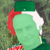
Entry #1 - "smol peepsi"
Submitted on December 1, 2016 by brzozod526
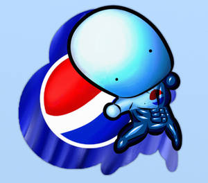
Overall, I was blown away by this image, from its shading to the incredible adaptation of Smol Nozomi.
Long live (and since it'
Remake the image above, into anything you want, and submit it here!
Submitting is simple:
Just post your submission as a comment, and I'll add the image to this post.
While there aren't any prizes for this contest, it's a great way to get publicity and feedback on your art!
Read the following Journal post for the full introduction, with the rules and other crucial details; I had to cut it from here due to data limitations on the post:
All currently-recognized submissions, with feedback from me, are below.
UPDATE: ALL FUTURE SUBMISSIONS WILL BE MOVED TO THE FOLLOWING POSTS.
Entry #1 - "smol peepsi"
Submitted on December 1, 2016 by brzozod526
Overall, I was blown away by this image, from its shading to the incredible adaptation of Smol Nozomi.
Long live (and since it'
And for more information on how this contest's Generations work, read this FAQ section:
[CONTEST] Smol Nozomi Remakes (FAQs and Rules)
The Contest:
Remake the image above, into anything you want!
Or, create an image in its style.
I'm posting this to address some FAQs I get about the contest,
and ones that people might hypothetically ask me, while clarifying its rules.
Here are links to the contest itself:
Question #1:
"Who/What inspired you to make this contest?"
My answer: Three Deviants deserve credit for inspiring me to make this contest, even if none of them directly worked with me in creating it:
Triple-Q
As far as I know, Triple-Q ( http://triple-q.deviantart.com/ ) is t
This time, instead of 40 entries (which barely fit into 1 post, due to data limits) for this generation,
I'll put as many entries as I can fit into Generation 2 without cutting back on details.
I can't say exactly what that amount was, but in Gen 1, it was around 35.
By the way - this contest is operated solely by me, but it was also approved for placement on the Pencils-Active Deviant Group.
( pencils-active.deviantart.com/ )
The-Dank-Meme-Squad
( the-dank-meme-squad.deviantart… )
LoveLiveCentral
( lovelivecentral.deviantart.com… )
and AnimeAraiansu.
( animearaiansu.deviantart.com/g… )
By the way, this contest now has a Deviant Group of its own!
smol-nozomi-remakes.deviantart…
All currently-recognized entries are below, sorted by the ranking I'd give them. New entries will be added to the list as their creators send them to me, and ratings at any given time are not permanent. So yes - there's always a competition for 1st Place, since every entry has the potential to take it.
UPDATE: ALL FUTURE SUBMISSIONS WILL BE MOVED TO THE FOLLOWING POST.
[CONTEST] Smol Nozomi Remakes (+ Other Smols) 3.0
Remake the image above, into anything you want, and submit it here!
Or make an original image in its style.

Submitting is simple:
Just post your submission as a comment, and I'll add the image to this post.
While there aren't any prizes for this contest, it's a great way to get publicity and feedback on your art!
Read the following Journal post for the full introduction, with the contest's rules and other crucial information:
Generation 3 of this contest is finally here, and submissions are being added!
To see the previous Generations of this contest, look here:
And for mo
Remake the image above, into anything you want, and submit it here!
Or make an original image in its style.
Submitting is simple:
Just post your submission as a comment, and I'll add the image to this post.
While there aren't any prizes for this contest, it's a great way to get publicity and feedback on your art!
Read the following Journal post for the full introduction, with the contest's rules and other crucial information:
Generation 3 of this contest is finally here, and submissions are being added!
To see the previous Generations of this contest, look here:
And for mo
Very Honorable Mention - "Chibi Blob|| Kunoichi Nozomi"
Submitted on December 6, 2016 (Officially added on December 10, 2016) by Kymeko
I was skeptical of giving this one a ranking, because while it is a chibi version of Nozomi, it's not quite in the smol style. And I wanted to keep the contest focused on the style of image mentioned before - remakes of Smol Nozomi, and original images in the same style as it. For future reference, I want entries to match that description. So I'm mentioning this one, but counting it as an entry into the contest wouldn't make that much sense. If it was an entry, I'd easily give it #1 as of right now.
This is a very well-made image, with nice shading, and an astonishing amount of detail, that doesn't make the image too visually busy. If you want more well-drawn manga/anime art like this, I'd highly suggest checking out and supporting the rest of Kymeko's work.
It may not be the type of art I'm interested in, but I respect the talent behind it.
Entry #1 - "I AM A SMOL SUPAHSTAR WARRIA"
Submitted on December 6, 2016 (Officially added on December 10, 2016) by Galaxianista

A very high-quality rendition of King Dedede, in every regard. The shading and colors are exactly as they should be. I especially love how the facial expression was adapted, to suit the smol style. Normally, Dedede has much bigger eyes, but the way it's done here works beautifully in this style. I wouldn't want it any other way.
Entry #2 - "Smol Rick and Smol Morty"
Submitted on December 17, 2016 (Officially added on December 22) by An-Evil-Wizard
Based on the characters of their eponymous show ( Reference image: vignette2.wikia.nocookie.net/r… ), these images have some of the best shading I've seen on any entry into this contest. What makes it stand out is the use of not just darker colors for shadows, but richer and darker colors (see how Rick's jacket is pink around the shadows, instead of just gray). The facial expressions are also superb, with simple but elegant details (such as the lines under Rick's eyes). The only improvement I could see is changing the shape of the shadow on Morty's face. If it was shaped more like the outline of his face, I'd see it as an improvement.
Entry #3 - “Todokete”Submitted on December 25, 2016 (Officially added on January 1, 2017) by Nuggeting
Just in time for Christmas, Nuggeting draws Smol Nozomi in a Santa hat, coat, and holding what I can only assume is a bag of gifts on her back. The captivating art style, which makes the whole image look like a stitching in fabric, also doubles as a way of showing depth – notice how all the “stitchings” are parallel, and appear only on the bottom right edges of the image. It takes a lot of skill to convey that using only lines – and it deserves credit. The only change I’d make to this excellent image is adding the bottom of the bag, which doesn’t appear for some reason.
Entry #4 - "A Smol Objection"
Submitted on December 16, 2016 by Secksy-sensei

I was blown away by this image, for multiple reasons.
HOLD IT! If you're not presenting criticism, how can this be constructive?
The fact that I see no way to improve this image doesn't mean I have nothing valuable to say about it. Entries as high-quality as this can be crucial learning examples for other artists.
With that being said, here's what impresses me about this image: a combination of original details (the suit, hair, eyebrows and new hand shapes) that mimic the likeness of Phoenix Wright, nice shading that reflects the art style of its series ( i.kinja-img.com/gawker-media/i… ) while staying true to the Smol Nozomi art style, and how many of these details are often used in subtle ways. For instance, the head has a white outline towards the front, to better illustrate the lighting on it. Altogether, Secksy-sensei made a beautifully original smol, that both suits this contest's art style, and makes many impressive additions of its own.
Entry #5 - "Contest Entries - Smoll characters"
Submitted on December 16, 2016 (Officially added on December 18) by Sanslet0n
While smols with these characters (Robbie Rotten, Sans, and Freddy Fazbear) or one visually similar to them have been made before, nobody has attempted to make them in this specific style. The shading on each of them fits remarkably well, with Sans's coat being a particular highlight. I especially love the way his sleeves are handled - not completely as a separate shape from the whole coat, but still visible. Easily, the best things this image has going for it are the shading and unique heads.
However, I do see a way to improve from here.
Freddy's ear should stick out more, and be a bit less wide. This would make more sense to me, given how his body is positioned.
But with that aside, this is a superb example of how an image can take liberties with the smol style (usually, a more muted color palette is used, with colors that pop out a bit less), and have them pay off.
Another entry on this list does this with similar skill - "smol dose of Pyrocynical".
Entry #6 - "smol dose of Pyrocynical"
Submitted on December 15, 2016 (Officially added on December 16) by DaPootisBird

OH DADDY [link] This is great! From the blending on the monitor to the shading on Pyro's jacket, some very skillful work is evident. And every detail from his profile picture seems to be here. Special praise has to go to how DaPootisBird managed to adapt both the image and its style, without making it a complete conversion into the smol aesthetic. It's still a smol, but it looks very distinct - it's because the lines are thinner than in traditional smols. I think that with all of this image's finer details (the hoodie strings, the small distance between parts of the monitor, etc.), this change makes complete sense. If the lines were more traditionally drawn, these details would be dwarfed by them, turning the image into a messy cluster of thick black outlines.
Like "Smol Fredbear", this is a case where details that would traditionally make the image a better smol (in that image's case, more gradated shading) were removed for good reasons.
Once again, to anyone making smols for this contest - think carefully about your source material, because decisions like these can be huge improvements to them. It's all on an image-by-image basis, and taking creative liberties can pay off, as it did for DaPootisBird.
Entry #7 - "Smol Fredbear"
Submitted on December 9, 2016 (Officially added on December 10, 2016) by SuperBioman4

Like with many of these images, I could go on and on about how great they look. Instead, I want to highlight why certain decisions made here work - specifically for its source material. While the style of shading is far more cartoonish than "I AM A SMOL SUPAHSTAR WARRIA", I think it's completely warranted, and any change to more realistic shading would be undesirable. Especially on the microphone, which looks plastic due to its lighting, is it clear why. Types of shading, even in stylized images of fictional characters, can reflect the texture of an object. In this case, the whole design of Smol Fredbear looks plastic, as it should. So to other artists - think carefully about textures and source material when designing shadows for your smols, because it'll pay off like it did here.
Entry #8 - "Smol Porky Minch"
Submitted on December 10, 2016 (Officially added on December 11, 2016) by An-Evil-Wizard
Based on a character from the Mother series (Best known for the SNES RPG, Earthbound), this image nicely reflects the shading style of sprites in Earthbound. Here's a reference image, to illustrate what I mean by that: rs560.pbsrc.com/albums/ss44/sp…
It's tough to explain precisely, but this is another case of an image that looks slightly plastic, like its source material.
(This is probably due to Porky appearing on the SNES first, forcing the artists for Earthbound to use barely-gradated light and shadows, to deal with sprite size limitations, leading to an art style where every object looks freshly-waxed)
I'd also like to give praise for the fact that the body seems to be completely original, while staying nicely within this art style. All around, the level of original detail within the smol style is truly something to behold.
Entry #9 - "smol scanty and kneesocks"
Submitted on December 9, 2016 (Officially added on December 10, 2016) [resubmitted on December 14] by marreeps
* by marreeps")
A reference image proved helpful in my judgment, and would do the same with yours.
vignette4.wikia.nocookie.net/v…
The smol faces added are easily among the best parts of this image. Smol Scanty's mouth in particular is nothing short of adorable, as are the eyebrows. On another note, the subtle shading on their hair is a welcome addition. I could go on and on, marveling at how well everything was recreated.
Entry #10 - “Smol Ryuko”Submitted on December 22, 2016 (Officially added on December 28) by SuperLooneyDude

Based on Ryuko from the anime Kill la Kill (.: Windows 100% December Model :. Ryuko by Duekko), almost every detail is reflected beautifully here. What are the exceptions? Ryuko’s red gloves, as seen in the reference image I used, are not here. Admittedly, this could be purely stylistic; drawing fingerless gloves on a smol is difficult, and might result in a less appealing image. So I’m okay with those being removed, if SuperLooneyDude couldn’t find a way to make the gloves improve the image rather than detract from it. But the arms are different (their sleeves aren’t short here, but are in the reference image), and the left arm appears a bit too small. By drawing its top line a bit higher on Ryuko, it would better show its connection to her shoulder. How high, more specifically? Enough so that it’s a bit below her collar’s edge.Furthermore, her hair appears notably different from its original illustration. To fix this, some of the parts extruding from the side should be shortened. Specifically, there’s 1 strand on each side that’s far longer than in the reference image.And this is more of a suggestion than a genuine issue, but I’d be curious how the image looks with eyebrows like Ryuko’s in it.While I know next to nothing about Kill la Kill, I appreciate seeing smols from media that I’ve never heard of, especially when they’re this good. With some revisions (which you’re allowed to make and resubmit with, by the way), this would be not just great, but excellent.Going back on Kill la Kill, and art from media I’m not familiar with, I’ve gotten smols from all sorts of fanbases (mostly games and anime) – Jojo’s Bizarre Adventure, Touhou, Pokémon, Five Nights at Freddy’s, Hetalia, and more. I’d highly encourage you to be like SuperLooneyDude with your entries, and make smols for whatever you like, even if you think I might not be familiar with it. Because picking unique source material helps your smol to stand out, and gives you a chance to experiment with different art styles.
Entry #11 - “Smol Nozomi”Submitted on December 18, 2016 (Officially added on December 28) by Pokediamond
It’s hard to overstate how adorable this image looks. With its rosy cheeks, gentle facial expression, the arms, and how the hair’s shading balances subtlety with an illusion of depth, there’s a lot to admire here. So much in fact, that I struggle to find any ways to improve it. All around, this image is an impressive original drawing. Keep up the great work, Pokediamond!
Entry #12 - "Russie"
Submitted on December 12, 2016 (officially added on December 16) by B-isou

The contest's second Hetalia-themed entry, this time based on Russia ( vignette1.wikia.nocookie.net/h… ),
this entry - from the hair to the blushing face - shows great resemblance to its source material. Furthermore, I don't know how this was made, but I love the style to it; the face has shading that makes it genuinely look cold. I'm also fond of how the eyes look, managing to be recolored in a way that actually helps the image.
Overall, this image hay an impressive array of unique details, with its superb facial features and style. And like with other highly original entries to this contest, it sets a good example for other artists to follow, when trying to design more unique smols.
Entry #13 - "smol zootopia [CONTEST ENTRY #3]"
Submitted on December 10, 2016 by woshhh
![smol zootopia [CONTEST ENTRY #3] by woshhh](https://images-wixmp-ed30a86b8c4ca887773594c2.wixmp.com/f/c963b836-c857-476a-9792-d147dc2e20d4/darabdb-f187ae4e-3194-4fed-a12a-69c9c2601a5b.png/v1/fill/w_600,h_500/smol_zootopia__contest_entry__3__by_woshhh_darabdb-fullview.png?token=eyJ0eXAiOiJKV1QiLCJhbGciOiJIUzI1NiJ9.eyJzdWIiOiJ1cm46YXBwOjdlMGQxODg5ODIyNjQzNzNhNWYwZDQxNWVhMGQyNmUwIiwiaXNzIjoidXJuOmFwcDo3ZTBkMTg4OTgyMjY0MzczYTVmMGQ0MTVlYTBkMjZlMCIsIm9iaiI6W1t7ImhlaWdodCI6Ijw9NTAwIiwicGF0aCI6IlwvZlwvYzk2M2I4MzYtYzg1Ny00NzZhLTk3OTItZDE0N2RjMmUyMGQ0XC9kYXJhYmRiLWYxODdhZTRlLTMxOTQtNGZlZC1hMTJhLTY5YzljMjYwMWE1Yi5wbmciLCJ3aWR0aCI6Ijw9NjAwIn1dXSwiYXVkIjpbInVybjpzZXJ2aWNlOmltYWdlLm9wZXJhdGlvbnMiXX0.z-W4gDHgQJajCj4hPu1iCnBDRRywE6WXLW8N0MZKDLU "smol zootopia [CONTEST ENTRY #3] by woshhh")
Woshhh returns, with another superb set of smols. The completely original faces brilliantly suit this art style. The subtle shadows are also a nice touch. This image is one of many examples of how something may look simple, but actually have a lot of details - a crucial case study for any chibi artist. You just don't notice most of them at first glance, because they look natural, and thus avoid standing out.
Entry #14 - “Smol Hapu”Submitted on December 22, 2016 (Officially added on December 28) by locomotive111

Inspired by Hapu from Pokémon: Sun and Moon Version ( cdn.bulbagarden.net/upload/thu… ), going from the reference image to this is rarely as easy as it is here. The only details that are missing: the outline of the middle part of her scarf, the line marking her hair’s parting, the lines across the middle of her shirt, and the triangle below it along her pants. There were also 2 bizarre choices: the inclusion of a line above her face’s edge (on the left side) and the abrupt end of a line along the right side of her hair (in between her hat and forehead, one can see how the hair’s edge seems to stop before continuing again, for seemingly no reason). But aside from what might as well be nitpicks, which locomotive111 can fix and resubmit here easily, the translation of Hapu’s details into the smol style is impressive.
Entry #15 - "Smol Hero"
Submitted on December 14, 2016 (Officially added on December 21) by SlimyFrick
Made shortly after the SiIvaGunner Christmas Comeback Crisis, this original drawing of Smol Nozomi running forward (presumably to save SiIva's old memes) has a strong resemblance to its inspiration. The lighting at the bottom is a nice touch, and adds greatly to this image's unique look. I especially love how the lighting is handled on Smol Nozomi's hair, with beautiful blending on its lit parts. The only changes I'd recommend are:
1. Making the part of the skirt on top of Nozomi's left leg not lit up. Why? Because logically, the light would be blocked by Nozomi's leg.
2. Adding some lighting to the bottom of Nozomi's arms. If her hair has the light shining on it, why wouldn't her arms?
3. Changing how the top of Nozomi's hair is darkened. Just using what looks like a darkened semi-circle is far from an elegant way of doing this. Instead, the darkened portion should be in the shape of the hair's outline.
But in spite of its room for improvement, this image stands as a truly unique drawing of Smol Nozomi - something that I haven't seen too much of in this contest, but it's totally allowed. And to improve this image would be building upon an already solid foundation, with great lighting and a unique pose. If anyone is considering making an original drawing of Smol Nozomi for this contest, I'd highly recommend checking out Triple-Q's reference guide, which can be found here: triple-q.tumblr.com/image/1490…
Entry #16 - "Smol Nozonic and Knuckles V2.0 [Contest entry #2]"
Submitted on December 6, 2016 (Officially added on December 10, 2016, and revised on December 11) by woshhh
![Smol Nozonic and Knuckles V2.0 [Contest entry #2] by woshhh](https://images-wixmp-ed30a86b8c4ca887773594c2.wixmp.com/f/c963b836-c857-476a-9792-d147dc2e20d4/daqwazs-2731ff4b-b3a9-4577-bf60-6054db450871.jpg/v1/fill/w_720,h_720,q_75,strp/smol_nozonic_and_knuckles_v2_0__contest_entry__2__by_woshhh_daqwazs-fullview.jpg?token=eyJ0eXAiOiJKV1QiLCJhbGciOiJIUzI1NiJ9.eyJzdWIiOiJ1cm46YXBwOjdlMGQxODg5ODIyNjQzNzNhNWYwZDQxNWVhMGQyNmUwIiwiaXNzIjoidXJuOmFwcDo3ZTBkMTg4OTgyMjY0MzczYTVmMGQ0MTVlYTBkMjZlMCIsIm9iaiI6W1t7ImhlaWdodCI6Ijw9NzIwIiwicGF0aCI6IlwvZlwvYzk2M2I4MzYtYzg1Ny00NzZhLTk3OTItZDE0N2RjMmUyMGQ0XC9kYXF3YXpzLTI3MzFmZjRiLWIzYTktNDU3Ny1iZjYwLTYwNTRkYjQ1MDg3MS5qcGciLCJ3aWR0aCI6Ijw9NzIwIn1dXSwiYXVkIjpbInVybjpzZXJ2aWNlOmltYWdlLm9wZXJhdGlvbnMiXX0.SPyJCVOrtBh4KkoW-ACjrURDv0F4N0i17KOhwEDwW6k "Smol Nozonic and Knuckles V2.0 [Contest entry #2] by woshhh")
This replica of the Sonic and Knuckles title screen may switch the positions of Sonic and Knuckles (who were originally on the left and right respectively), but that's more of a nitpick than a critique of the image.
But with that aside, the rest of this image is an exceptional drawing.
The characters look as they should, and the minimalist background both evokes and tastefully adapts its source material, keeping the focus on its 2 smols while adding nice scenery. It's yet another great entry from woshhh.
Entry #17 - "Smol Brimley"
Submitted on December 7, 2016 (Officially added on December 10, 2016) by TheRealGreatTd3alleo

Wilford Brimley is an actor, who has appeared in many advertisements, most notably for Quaker Oatmeal.
His likeness manages to be replicated very well here.
i.ytimg.com/vi/aVIewv1K3CA/hqd…
I was pleasantly surprised that the lack of a nose didn't make the image unrecognizable.
If a nose like Brimley's was included, it would definitely look out of place in this style.
Entry #18 - "Zacharie... smol [Contest Entry #5]"
Submitted on December 14, 2016
(Officially added on December 18) by woshhh
![Zacharie... smol [Contest Entry #5] by woshhh](https://images-wixmp-ed30a86b8c4ca887773594c2.wixmp.com/f/c963b836-c857-476a-9792-d147dc2e20d4/darri31-059676d4-c65c-42f3-a0e9-c8edc044f35a.png/v1/fill/w_600,h_600/zacharie____smol__contest_entry__5__by_woshhh_darri31-fullview.png?token=eyJ0eXAiOiJKV1QiLCJhbGciOiJIUzI1NiJ9.eyJzdWIiOiJ1cm46YXBwOjdlMGQxODg5ODIyNjQzNzNhNWYwZDQxNWVhMGQyNmUwIiwiaXNzIjoidXJuOmFwcDo3ZTBkMTg4OTgyMjY0MzczYTVmMGQ0MTVlYTBkMjZlMCIsIm9iaiI6W1t7ImhlaWdodCI6Ijw9NjAwIiwicGF0aCI6IlwvZlwvYzk2M2I4MzYtYzg1Ny00NzZhLTk3OTItZDE0N2RjMmUyMGQ0XC9kYXJyaTMxLTA1OTY3NmQ0LWM2NWMtNDJmMy1hMGU5LWM4ZWRjMDQ0ZjM1YS5wbmciLCJ3aWR0aCI6Ijw9NjAwIn1dXSwiYXVkIjpbInVybjpzZXJ2aWNlOmltYWdlLm9wZXJhdGlvbnMiXX0.bDAYsuVFvYr-9HTWf7LHxAqKZ_WzUuI3pig2ZpbulkU "Zacharie... smol [Contest Entry #5] by woshhh")
Woshhh returns for a fifth entry, this time based on a character from the indie game OFF. (Reference images: [1] [2] ) These smols beautifully mimic their source material, from the stitches on one's heart pattern to the masks. The unique facial expressions help to distinguish this from other entries. All that I'd change is the hair; if you look at those reference images, you'll see very different hair styles from the smols. So to woshhh, when revising this entry, make sure that the hair resembles the original characters more.
Entry #19 - “Smol Me”Submitted on December 24, 2016 (Officially added on December 30) by IndieAnjelo
Based on its creator’s profile picture (The Real Ref of Me), and does a stellar job resembling it. Though I think some omissions from this image could be included to great effect. For instance, leaving white circles on the bottom of the feet, and making the rest the same color as your avatar’s shoes would help the feet to resemble their original counterparts. Adding your avatar’s hair would also help, if you can find or make room on the head for it. I’d also have the hoodie resembling its left side more on the right, so both sides show it hanging on your smol’s shoulders. Adding the pockets and straps of its hoodie would be a welcome addition too. But even without all these details, it’s an excellent rendition of IndieAnjelo’s avatar, that gets so many of its details right.
Entry #20 - "Smol Dickman Baby"
Submitted on December 6, 2016 (Officially added on December 10, 2016) by Helmetpig2013

Kingpin, Meme Meme Man baby! He wrote this and likes your image.
But the back of the hair's top shouldn't be flat, but instead rounded. The dollar sign on his chest could also look less like a backwards 2. The belt buckle could also be bigger, with the word "DICKMAN" written on it. Aside from that, what's here is a very nice smol rendition of The Dickman.
Entry #21 - “Smol Cory”Submitted on December 23, 2016 (Officially added on December 29) by AlphaShitlord
![Smol Cory [CONTEST ENTRY] by AlphaShitlord](https://images-wixmp-ed30a86b8c4ca887773594c2.wixmp.com/f/26ce9ded-6532-4d05-913c-4d4cc32d6eaa/daspi29-546de80a-9c56-4702-8bdf-996c4a0b2a4b.png/v1/fill/w_894,h_894/smol_cory__contest_entry__by_alphashitlord_daspi29-pre.png?token=eyJ0eXAiOiJKV1QiLCJhbGciOiJIUzI1NiJ9.eyJzdWIiOiJ1cm46YXBwOjdlMGQxODg5ODIyNjQzNzNhNWYwZDQxNWVhMGQyNmUwIiwiaXNzIjoidXJuOmFwcDo3ZTBkMTg4OTgyMjY0MzczYTVmMGQ0MTVlYTBkMjZlMCIsIm9iaiI6W1t7ImhlaWdodCI6Ijw9MTAyNCIsInBhdGgiOiJcL2ZcLzI2Y2U5ZGVkLTY1MzItNGQwNS05MTNjLTRkNGNjMzJkNmVhYVwvZGFzcGkyOS01NDZkZTgwYS05YzU2LTQ3MDItOGJkZi05OTZjNGEwYjJhNGIucG5nIiwid2lkdGgiOiI8PTEwMjQifV1dLCJhdWQiOlsidXJuOnNlcnZpY2U6aW1hZ2Uub3BlcmF0aW9ucyJdfQ.Xc8Cdm8o6qXVkCTS7xVfplFX5IGRJUzuEcvoYL2b41I "Smol Cory [CONTEST ENTRY] by AlphaShitlord")
Based on the early-2000s anime Cory White House de Chou Taihen (its English dub is known as Cory in the House), and its protagonist Cory-chan, this image nails his distinctive, corydere look ( vignette2.wikia.nocookie.net/c… ). The shading on his head is a particular highlight, with some masterful gradation. The only thing that’s not desu kawaii about Smol Cory-chan is the outline he’s given. At least on the side touching the background, his outline could be smoothed out greatly. In addition, some shading on the inner part of his right leg, the right side of his torso and the lower part of his left arm would be a welcome inclusion. And if you could add the shield-like shape seen on the side of the shirt, that would also be great. Cory is best husbando~~and Smol Cory is almost best cory ^_^(I’m obviously referencing the running joke/meme about Cory in the House being an anime)
Entry #22 - "Smol Smoke"
Submitted on December 9, 2016 (Officially added on December 10, 2016) by shabo-desconocido

shabo-desconocido: Can I take your order please?KingpinOfMemes: I'll have some white sleeves, a right arm that looks like the torso goes in front of it, with cheese.
Nice meme you've got there. The whole image beautifully fits the smol art style. Aside from my order above, I couldn't ask for more.
Entry #23 - "Smol Nozojames"
Submitted on December 15, 2016
(Officially added on December 16) by KittyObi

Some explanation is required: James is an emoji-esque character from the instant-messaging app, LINE. To read more about it, and find a reference image of James, the following links will be useful:
en.wikipedia.org/wiki/Line_(ap…
cdnimages.abs-cbnnews.com/grap…
After looking at those, it's clear that everything about James's likeness - the hair, its shine towards the top, the clothes - is reflected perfectly here. And no - the fact that the hair's back outline ends at the bottom is not a mistake.
I only put other images above this one because they're more visually impressive to me; it has nothing to do with KittyObi's limitations as an artist, but rather the limitations of this entry's source material. With James as its inspiration, this has to be somewhat simple - and it thankfully is.
Entry #24 - “Full smol nozomi contest entries”
Submitted on December 21, 2016 (Officially added on December 28) by flamestar1031

Three smols – a version of Guzma ( www.pokemon-sunmoon.com/media/… ), Gomez (from the game Fez), and a different version of Smol Nozomi herself can be seen here. All the details on Guzma look as they should; I especially like the eyebrows and mouth, adding a unique expression to the whole image.
As for Gomez, the only issue I see is the right eye’s placement. To me, it looks excessively far from his mouth. This could be fixed by either bringing his right eye closer to his mouth, or moving the mouth closer to his right eye.
With Nozomi, the lighting on her hair and clothes are nicely subtle. That same shading is visible on every part of the drawing, but most prominent there. Altogether, it’s a superb take on the contest’s seminal image, that still feels unique, thanks to a different color scheme and a slightly altered eye shape.
Entry #25 - "smol aru"
Submitted on December 12, 2016 by wingsof-freedom

Based on China from Hetalia
(a reference image can be found here: images4.fanpop.com/image/photo… ),
this image - from its hair to the uniform - strongly resembles the original.
One detail I find particularly notable is the mouth - it's vastly different from any entries I've gotten before, yet fits in beautifully with the smol style.
And especially on the hair, the style of shading used adds greatly to this style. Though I do see room for improvement:
1. Add shading to the patches on China's uniform.
2. Perhaps change one spot of shading on her hair - where it becomes extremely light.
I don't see the point of using 3 ovals to represent the top of the hair;
maybe use either a shape in the same color, that matches the hair's shape on that part, but is smaller, or making those portions look more like the parting of her hair.
Either way, I think experimenting with that part of the hair would be valuable.
But altogether, this is a fairly original smol in every regard,
and what's there remains a testament to how this style can be used for very unique images, not just Smol Nozomi remakes.
Both are great, but I'd encourage anyone wishing to submit something to this contest to at least consider making a smol from scratch;
it makes the contest more interesting for all of us.
Entry #26 - "Smol Hoborg - The Smol Neverhood"
Submitted on December 11, 2016 by DaPootisBird

After searching for a reference image, I found out this was a character from some game called "The Neverhood". ( vignette1.wikia.nocookie.net/t… )
With feedback from me, shading was added, and the top of Hoborg's head became visible. Altogether, this is a well-made image, that closely matches The Neverhood's claymation style.
Entry #27 - "Smol Acerola"
Submitted on December 18, 2016 (Officially added on December 27) by SuperYoshi626
Based on a character from Pokemon: Sun and Moon Version (Reference image: Acerola), this smol's inspiration can be seen with ease. From the hair's shape to the dress, it's all a convincing imitation of Acerola. The only issue I have is minor: for some reason, in between the right hand, head, and arm, there's a black triangle. I think the shoulder might have been made a bit too small, leaving more than enough space for the right arm, with a black triangle being the excess space. Just extending the right arm more into it would remedy this issue. But overall, it's a very well-made rendition of Acerola in this style.
Entry #28 - “WHAT HAVE I DONE-”
Submitted on December 22, 2016 (Officially added on December 28) by gunvoltfan101
What have you done? Here’s what you’ve done – a pretty good job overall at recreating Chita from The Nutshack
( vignette1.wikia.nocookie.net/t… )! But I do see room for improvement; for one thing, the portions of Chita’s hair that stick down are a bit thick, and should be thinned out to show the sides of her face. Secondly, her hat could be a lot more rounded – especially in the back, where it’s too flat, and could be a bit taller. Since this a hand-drawn image, I’d recommend uploading the revised version separately, to preserve both images.
Entry #29 - “Smol Timeler”Submitted on December 24, 2016 (Officially added on December 30) by Ronylicous
Inspired by Timeler, an OC that Ronylicous made (Timeler [REFERENCE IMAGE]), this image captures it down to the smallest details.
There are only 2 changes I’d like to see from it: 1. Making the points on the clock’s bottom 2 hands look more like triangles. 2. Making the white portions next to the letter T completely white, by coloring them in more. That should make them resemble the original more.Aside for it being an OC, this image stands out for its black-and-white color scheme. This helps to highlight its various details, from the tie to the clock’s hands. Altogether, it’s a very unique entry, with quality that’s high enough to support its distinct style.
Entry #30 - “Marge Krumping nozomi”Submitted on December 26, 2016 (Officially added on January 2, 2017) by thefastbootleg
Based on a meme from The Simpsons ( i2.kym-cdn.com/entries/icons/f… ), this image captures the basic look of the original. There’s not much that it could improve on, since it has all of Marge’s major details, though if the lines on the dress resembled the original more, it would help.
Entry #31 - "Smol Callie"
Submitted on November 26, 2016 (but discovered by me and officially added on December 12) by TheGamingSpoon
Based on a character from Splatoon ( pm1.narvii.com/5773/d6180e1d2a… ), all (from the image I linked you to) of her major details appear to be here. Yet it's the way they're implemented in which I see room for improvement. For instance, the part covering the eyes could resemble its original shape more. The dress could also use the pink outline at the top, like the original. And overall, but especially on the hair, the image would benefit from some shading. For the hair, I'd recommend making it a bit lighter, and then darkening it where appropriate. The same could be said for whatever is on top of her head; with some shading, it would look much better.
Entry #32 - "chara nozomi"
Submitted on December 10, 2016 by thefastbootleg
For the most part, this image looks as it should. All I'd change is the head's position. It should be in front of the right hand, and lower on the body. This way, you don't have a strange portion of the body going above the arms, to reach the head. In other words, the image would look better without this neck-like portion.
Entry #33 - "Sonic's Smol Adventure"
Submitted on December 7, 2016 (Officially added on December 10, 2016) by JPToast
From its legs to the face, this is a very nice-looking design that suits the style of these images. If the lines could look a bit less pixelated, then this would be excellent all around. One way to make the lines smoother is by getting a bigger version of this image, and then smoothing out the lines from there. This way, you have more pixels to work with, and thus use to smooth the line. Other artists - take note of how this image successfully takes its source material into the smol style. I'd recommend looking at a reference image, and comparing it with this, to see how it changed, namely the way that details were made into their smol forms. It'll be very useful to everyone entering this contest.
Entry #34 - "Smol Weapons"
Submitted on December 8, 2016 (Officially added on December 10, 2016) by andyhulk1983
I enjoyed seeing how the Heavy's face translated into the smol style. Though this image is missing the belt of bullets that goes across his chest - I'd add that. I'd also try to smooth out his mouth - it looks less round than it should (some parts of the curved portions look too much like straight lines).
Entry #35 - "Smol Caezomi"
Submitted on December 9, 2016 (Officially added on December 10, 2016) by melonken
This was based on Caesar Zeppeli, from Jojo's Bizarre Adventure.
Here's a reference image:
vignette4.wikia.nocookie.net/j…
I noticed some differences between this and the image I linked to, however. Only the collar of Caesar's shirt is pink - the rest is green. Furthermore, the wings on his head are gold, and longer. Also, his pants should be an almost turquoise color, with knee pads and green shoes.
Since this is hand-drawn, I'd recommend uploading the version with any changes you want separately. This way, it's not impossible to find the original image, in case the changes don't look as good as expected.
Entry #36 - "woodmans return"
Submitted on December 10, 2016 by thefastbootleg
Yet another woodman image. It seems that he's infected this contest almost as much as he's infected SiIvaGunner's channel. The only major change I'd make here is making his eyebrows green. Aside from that, this is actually a - say it with me - nice take on Wood Man's MS Paint version.
Entry #37 - "Smol Nozomi"
Submitted on December 18, 2016 (Officially added on December 27) by GoldenWorld59
As drawn by the girlfriend of GoldenWorld59, this image captures the shape and style of Smol Nozomi effortlessly. Though if it were colored in more, or the existing coloring was made thicker (so it wasn't just a series of densely-drawn lines) the image would easily be one of the best hand-drawn entries I've gotten.
Entry #38 - "The (smol) Voice [CONTEST ENTRY #4]"
Submitted on December 14, 2016 (Officially added on December 18) by woshhh
![The (smol) Voice [CONTEST ENTRY #4] by woshhh](https://images-wixmp-ed30a86b8c4ca887773594c2.wixmp.com/f/c963b836-c857-476a-9792-d147dc2e20d4/darr0mf-8675193f-5f44-40f5-8a9e-a986db54bcbf.png/v1/fill/w_600,h_600/the__smol__voice__contest_entry__4__by_woshhh_darr0mf-fullview.png?token=eyJ0eXAiOiJKV1QiLCJhbGciOiJIUzI1NiJ9.eyJzdWIiOiJ1cm46YXBwOjdlMGQxODg5ODIyNjQzNzNhNWYwZDQxNWVhMGQyNmUwIiwiaXNzIjoidXJuOmFwcDo3ZTBkMTg4OTgyMjY0MzczYTVmMGQ0MTVlYTBkMjZlMCIsIm9iaiI6W1t7ImhlaWdodCI6Ijw9NjAwIiwicGF0aCI6IlwvZlwvYzk2M2I4MzYtYzg1Ny00NzZhLTk3OTItZDE0N2RjMmUyMGQ0XC9kYXJyMG1mLTg2NzUxOTNmLTVmNDQtNDBmNS04YTllLWE5ODZkYjU0YmNiZi5wbmciLCJ3aWR0aCI6Ijw9NjAwIn1dXSwiYXVkIjpbInVybjpzZXJ2aWNlOmltYWdlLm9wZXJhdGlvbnMiXX0.y4L9asuQK-1Lt1Fu5RBBgpR_Biz6eW5JbVk-U92a0Q4 "The (smol) Voice [CONTEST ENTRY #4] by woshhh")
Based on the SiIvaGunner reboot character of the same name, specifically the visual design he's gotten in the Christmas Comeback Crisis, the image was expected to be this simple from the start. However, that doesn't mean I see no ways to change it; the lighting on the left hand could be altered. I would extend the light down to the right side of the hand, to show how it would realistically stick out from the arm, and reflect some light.
Aside from that, it's a high-quality smol that couldn't be any more complex, without straying from its inspiration.
Entry #39 - "Smol Nozomi"
Submitted on December 14, 2016 (Officially added on December 18) by Keebster101

A drawing of Smol Nozomi made on Miiverse. The only details that seem to be a bit off are:
1. The right arm, instead of being partially covered by the torso, should appear more behind it. The original image has an almost triangular shape for that arm, while this one connects it to the torso.
2. There's a line between 2 parts of the hair, on the right side of the head, that's only partially drawn here. Near the right eye, this line should intersect the edge of the hair.
Nonetheless, this remains an impressive effort for drawing in Miiverse, with so many details from the original Smol Nozomi captured near-perfectly.
Entry #40 - "Smol Grandrappa"
Submitted on December 3, 2016 (Officially added on January 2, 2017) by MarappaLGamer
Without a reference image, given that it's the profile picture of its creator, I'll have to judge this image purely on its own merits. So on that note, the image makes nice, subtle use of lighting on its edges. Its lines have appropriate thickness, for the most part. The one exception is the right ear, which has lines that are far too thin. Its facial expression could also be revised, with much less jagged lines. Furthermore, some shading on the bandanna's left side, while not necessary, would be an interesting addition.
Entry #41 - "I am a dumbass"
Submitted on November 9, 2016 (Officially added on December 10, 2016) by GeneralAisaku
The 4 characters from this are: Pacha from The Emperor's New Groove, Ness (NOT Sans) from Earthbound, "Buff Riku"
( knowyourmeme.com/memes/buff-ri… )
and Tharja from Fire Emblem: Awakening.
( fireemblemwiki.org/w/images/th… )
That interesting roster aside, all of these smols seem to look decently like their source material. The only one where I can see notable issues is Tharja. From the reference image above, one would think that the smol version should:
1. Have rings on her legs.
2. Have a cape that's maroon on the inside, outlines by black.
3. Have the portion around her waist by gold, instead of black.
Once again, these are all good smols; I just think that Tharja's could use some improvement.
Entry #42 - “Lolbit is the Best Meme”Submitted on December 20, 2016 (Officially added on December 28) by Fi-Fi-theDestroyer

Based on Lolbit from the Five Nights at Freddy’s series ( vignette4.wikia.nocookie.net/f… ), I’m solely judging the version in the middle, since it’s the only Smol Nozomi-related one here. But the advice I’m going to give will apply to all 3 versions of Lolbit seen here. First off, while most of the character’s details are reflected here, some appear to be missing or altered. For instance, the reference image lacks the small notches in Lolbit’s ears that we see here. Furthermore, Lolbit’s eyelashes and the tuft of hai/furr on top of its head are missing. And the way its hair/fur curves upwards lower on its head is inaccurate; in the reference image, you’ll notice a slight downward curve on the extruded part. And on that same part, you never see the hair/fur split up like it does here; instead, it stays together, forming one large, roughly triangular shape.As for the mouth, it doesn’t need to look as slanted as it does.While I see a lot of ways to improve the image, don’t let that mislead you into thinking that I have nothing positive to say about it. Even with the unexplained departures from its source material, this drawing looks satisfactory. Maybe not very impressive, but decent.
Entry #43 - "Smol Cross"
Submitted on December 13, 2016
(Officially added on December 18) by Mcsplosion

I can't tell what exactly this is based on, but an educated guess would be its creator's profile picture, which bears a lot of resemblance. Using that as a reference image, every detail seems to be carried over. With that being said, I do see some room for improvement - chiefly, in how the lines are drawn. Compared with the original Smol Nozomi, this one has lines that look more like crayon. I'm not too sure how to explain it, but the original Smol Nozomi had lines that looked less pixelated - and that's what I hope to see in this image.
Entry #44 - "Smol Killer Queen Nozomi [UPDATED]"
Submitted on December 10, 2016 (Updated on February 19, 2017) by cookiecat7
Apparently this is based on a character from Jojo's Bizarre Adventure. I guess there's a lot of overlap between fans of Jojo, SiIvaGunner and maybe Triple-Q; this contest has gotten over 3 entries based on characters from that series.
Here's a reference image for Killer Queen:
vignette4.wikia.nocookie.net/j…
While this updated version adds all of the details that the first version missed, it could still benefit from smoother lines, and abdominals that are drawn a bit larger, to better reflect how they look on Killer Queen.
Entry #45 - "Smol Nyami"
Submitted on December 12, 2016 (Officially added on December 13) by Pepper-Color

Based on a character from the "Pop'n Music" games ( vignette3.wikia.nocookie.net/p… ), most important details are here and well-made. However, there are exceptions to that rule, which I noticed after looking at that reference image. For one thing, the the collar of her shirt isn't visible. Secondly, the design of the shoes isn't included here, as comparing this with the reference image shows. And the top of the hair should contain the strands shown there as well.
But what's here is still a very competent start, even if it doesn't completely resemble its source material.
Entry #46 - "Nozomi recreation for a nozomi remake thing.png"
Submitted on December 8, 2016 (Officially added on December 10, 2016) by 4nt1st3v3g0ku

This image, with its nice lighting, would easily be higher up if its Smol Nozomi was better drawn. I think it might also be interesting to see Smol Nozomi standing on the lighthouse and facing it, so the high-quality shading work could be put to better use.
Entry #47 - “Smol Nozomi (Hand Drawn)”
Submitted on December 22, 2016 (Officially added on December 28) by FnafFan54321
 by FnafFan54321")
While this image recaptures all the features of Smol Nozomi, and nicely mimics its face, the real room for improvement lies in its proportions. The torso could be far less wide. In addition, the legs could be a bit wider. And the left side of her hair should be longer and wider, to better match the size of the right side. As for the head itself, it should be smaller, and the right side should be brought in closer to the right eye. Comparing this image with the original Smol Nozomi would be very helpful when revising this one. If you plan on doing so, I’d recommend uploading the revised version separately, to preserve both images.
Entry #48 - "2D Nozomi"
Submitted on December 22, 2016 (Officially added on January 1, 2017) by milky-bot
Based on 2D, a character from the band Gorillaz ( image.wikifoundry.com/image/1/… ), this image gets at least some of the details from its inspiration. The colors are right, but everything else is either missing or in need of revision. For instance, the mouth has bizarre white portions around it, that look like an editing oversight. And a backwards hat should be added, to mimic the reference image more closely. For the same reason, the hair should also have more strands sticking down, while the shirt should include its official design. To better match that, I'd also recommend making the sleeves yellow, with red (instead of blue) stripes. I also think a new torso shape would help; the curved portion by 2D Nozomi's left arm looks out of place, and should be either shortened or removed entirely. The hair's gradation looks nice, though it's interrupted by some pure blue parts along the edges, that look like lines drawn accidentally. And speaking of unusual lines, a part of the right hand's outline overlaps the hair, and goes beyond the hand itself.
Even with all this image's faults, the potential for a better version is definitely there. I'd highly encourage milky-bot to submit a new version of this.
Entry #49 - "mm2nozomi.mid"
Submitted on December 11, 2016 (officially added on December 12) by YoungMario14
While this image's own creator described this image as "terrible", which to some might suggest that he wasn't trying very hard to make it, I'm going to try and be constructive about it anyways.
First, the helmet is significantly larger than it needs to be. Secondly, the buster is too long. Third, on the left leg, the thigh is unnecessarily large compared to the foot. They should be of more comparable sizes. And fourth, the lines on the helmet could be drawn better; the helmet itself should be more round, while the blue portions in the middle should have straighter lines. So whether or not YoungMario14 was trying or not is irrelevant; because images like this are a valuable exercise for any artist's critical eye.
Entry #50 - "Juan Smol"
Submitted on December 9, 2016 (Officially added on December 10, 2016) by supersonicfan66
This image seems to be based on its creator's profile picture, or at the very least, a character named Juan that appears in much of his art. I'd recommend 3 changes to this image's creator.
1. Touch up some of the lines. Their thickness seems to vary wildly, in ways that don't add to the image's style.
2. Add some shading to the shirt. To achieve this, you could make parts of the white squares gray, where shading is supposed to be.
3. Redo the glasses, so that their lenses look more like rectangles.
As for what's done well, I will say that the likeness of Juan, the character this is based on, is reflected in this smol.
Entry #51 - "Smol Wars"
Submitted on December 8, 2016 (Officially added on December 10, 2016) by The-Daily-Maff

I don't see the purpose of changing Vader's eye - is it a reference to something? I would've appreciated a different way of changing the logo - maybe parts of letters could be spliced together to form new ones, or the creator could've made new letters completely by scratch. The prospect of doing that is completely realistic, even in MS Paint. If you look through my Gallery, you'll see 2 notable examples of this happening - the logos for "Bernie Ex" and "Dat Boi Solid", both of which were made purely in MS Paint. What we have now, in terms of a logo, isn't impressive. Also, the Smol Nozomi heads could be used to greater effect - there are still some gray-white outlines on them that could be easily cleaned up. And obviously, the head on Luke should have a lighter orange as its skin color, like the rest of his body.
Here's an idea - try remaking the poster, so that it's all drawn in the Smol Nozomi art style. From the characters to the scenery, everything could be made in that same style. I don't know how it would look, but it would make for an interesting image.
Entry #52 - "Thomas the Smol Nozomi Tank Engine"
Submitted on December 7, 2016 (Officially added on December 10, 2016) by Fisherthekitten
Admittedly, this is a hard one to do, but if the lines were drawn better, and some shading was added, this image would be a lot better. I'd also be interested in seeing what happens if the face is colored gray, like with the original Thomas.
Entry #53 - "7 Grand Nozomi"
Submitted on December 20, 2016 (Officially added on December 27) by TheDukeOfLuke
Disregarding this image's shared inspiration with SynergicStar's "Smol Nozomi [GRAND DAD EDITION]", I'm going to judge this image on its own merits. Of course, it resembles Grand Dad closely. However, the lines are drawn sloppily, and could be much smoother. Grand Dad's left arm is way too large, with lower portions resembling the flaps of a bat wing. The eyes are way too small, and look almost as if they're melting. This image leaves a lot to be desired.
I can't tell whether or not its many issues were intentional, but that's no excuse for me to avoid talking about them. Every entry into this contest counts; and if all you can muster is a low-quality MS Paint doodle, that's still better than nothing. Because with a little feedback, you could turn that doodle into well-made art. This entry from Generation 1 illustrates that point beautifully: [LINK - (Gen 1 - Entry #15)]
Entry #54 - "sml nozomeh"
Submitted on December 8, 2016 (Officially added on December 10, 2016) by BobDaScatcherGuy

"If mine [the image above] doesn't win, I'll poop out cats."- BobDaScatcherGuy
With consequences like that, I knew the prospect of reviewing this image would be difficult. And that, as well as the clearly intentional mistakes in this image, mean that in order to give constructive feedback, I'll have to take this image seriously, even when its creator clearly didn't.
This sure puts the "meh" in "sml nozomeh".
I can't tell what these abstract scribbles are supposed to be, but if I had to guess, it'd be the product of a neutron emitter. ( Here's a video of that: [link] )
So that might explain why there are white blotches all over Smol Nozomi's skin. Those blotches aren't the product of lazy coloring, but some bad reaction to radiation inside the neutron emitter. Though I'm not sure why the skirt is only partially blue. But the purple right leg is DEFINITELY a product of radiation exposure.
So a better title for this image would be: "SMOLout: Noob Vegas".
(Unfortunately, no such box art exists)
Closing Halation [Tribute to SiIvaGunner]
Recently, the SiIvaGunner YouTube channel was taken down over multiple copyright strikes. While there's a chance the claims will be removed, thus restoring SiIvaGunner, I thought now was a good time to pay tribute to a channel that's entertained and influenced me so much over the last 2-3 years.
Hence why I made the track below - a mashup of "Closing Time" by Semisonic and "Snow Halation" by μ's. Alternatively, you can also find it on YouTube:
Note that this won't be the end of the SiIvaGunner team. For more info on the future of SiIvaGunner (including plans for the new channel, backups of old rips, etc.), check their official Q
[MASHUP] U.N. Eminem Was Kamikaze?
U.N. Owen Was Her [from Touhou 6:EoSD] + Kamikaze [by Eminem]
This mashup can be found on my SoundCloud page:
Or on YouTube:
Want more mashups like this?
Then check out my collections:
[MASHUP] Jetstream Shady (MGR:Revengeance, Eminem)
The Only Thing I Know for Real [from Metal Gear Rising: Revengeance] + Chloraseptic (Remix) [by Eminem ft. 2 Chainz, Phresher]
This mashup can be found on my SoundCloud page:
Want more mashups like this?
Check out my collections:
Or a similar mashup I made, combining "Lose Yourself" with "It Has to Be This Way":
Featured in Groups


© 2016 - 2024 KingpinOfMemes
Comments141
Join the community to add your comment. Already a deviant? Log In
i was expecting a Sonic one
G E T S T W O
G E T S T W O